
|
These are the final images I created for The Spark Show. My process for this image started with one word in the middle: create. I decided to make the background black to have more of a contrast between the colors of the ring and the word in the middle. I chose to make a series of words because I thought that would be more challenging to make. For the color themes, I chose colors that I associated with the word, like for Grow I chose greens and purples, and for Spark I chose reds and yellows. What I was aiming for was a simple piece that creates emphasis on the word in the middle. I left black space in the middle to help create that. I am overall satisfied with my pieces and I like the look of the colors and composition.
0 Comments
Tell me about the feedback you got during yesterday's share. If you were to revise your tree, what would you do and why?
During yesterday's share, I got a lot of feedback that I expected and didn't expect. My tree 3 originally wasn't finished, so I felt like it was lacking some detail, which is what some of my peers said. Some feedback that I wasn't expecting was how different my piece looked compared to others. When revising my tree, I added detail in the back, but if I had more time, I would add more detail. I would also change the fonts depending on the word. Some of my peers told me that there was a little bit of a lack in hierarchy, so I made the words "little tree" larger than the other words so that it attracts the viewer's eye. I also left the space around the tree blank to create a contrast between the white and the image to show that it is a focal point in the piece. I learned that putting words with images is more difficult than it seems. How do you feel about your final identity? Happy? Excited? Settling for it? How has it evolved over time? Do you feel it is very different from what you started with or have you had this idea for a while? How do you plan to use the logo... are you going to do more with it, like use it elsewhere? How did mockups go for you? Are you creating more?
I am very satisfied with my final logo. It has evolved greatly since I first created it. I changed the colors of the logo, and evolved it by separating pieces of the logo and adding the gradients on each side. I like how I still kept the central idea of the circle logo and design, but it has evolved. I plan to use the logo for my future design projects that I create in Design 2. The mockups went good for me, but I don't think I will be creating another logo until I want one, because going through that process was very difficult. 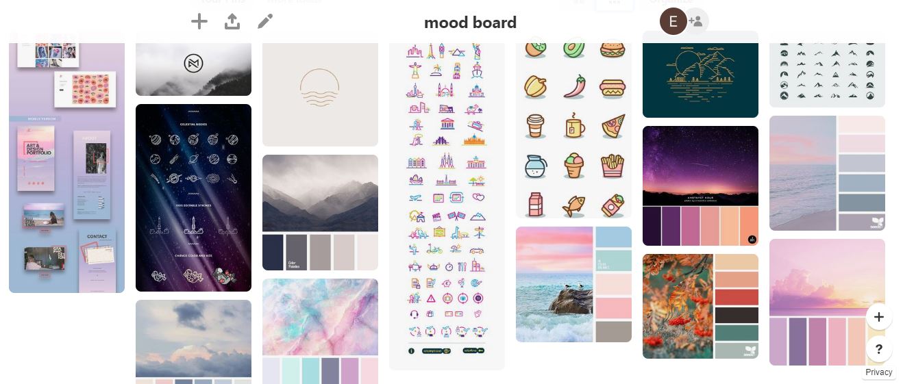 My Pinterest Board was a huge influence that helped shape my personal design. Starting off, I definitely wanted a simple design that could be very versatile and used anywhere. Pinterest was a way to give me an inspiration for my mood board and helped set me along the path of creating a final personal logo.  Another large part that makes up the personality of my logo is the font. The fonts that caught my eye ranged from super simple fonts to fonts with a little more character. The capitalization of certain letters also creates a whole different style to the logo. I found that bolder fonts looked more shocking when they were in all caps, and thinner and more simple fonts looked clean with either no capitalization or only capitalization in the first letter of the first and last name. The font that I ultimately ended up choosing was the second font, named Suprema, because I liked the rounded look. I think that I was also scared to try a crazier font in fear that it would look tacky.  The next step was choosing a color theme. When looking at the different themes, I found that I was naturally more attracted to palettes with softer colors and a more common color theme. I really liked the combinations of purples, pinks, or blues in these palettes. I ended up choosing the third palette, because I liked that it incorporated blue, purple, and pink colors that were soft, but there was also that dark navy color in it too. Next was choosing an icon and the different types of colors within the icon. For the circle made up of lines, I really liked the idea of how the negative space plays a huge role in how the icon looks as a whole. For choosing colors for these circles, I liked doing patterns of dark to light or vice versa. For the full circles, I liked how they were simple, but could be changed with the different color combinations. My favorite icon is the blue circle with the lighter blue, I just like the similarity in the two colors and how the slight curve in the line gives the circle character.  This is the final 10/10/10 Project. What I found the hardest part about this project was creating an icon or logo that fit well with my name. I found that putting my name with a circle icon was harder to incorporate than a different shape. I also think that I might have made my designs a little too simple, but hopefully they are not too boring. I do like the simple and clean look of my name and the icon. Maybe if I could change anything about my logo it would be to try it with a color scheme that has a more drastic difference in color. What I learned from this project is that coming up with personal and professional logos are much harder than it looks, and it is key to find the best combination of colors, icons, and fonts to make the logo the best that it can be.
 Describe what you have found that you like... what types of fonts and colors are you drawn to? What types of imagery? What are you finding inspirational?
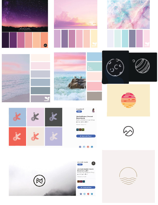
I think that a common theme throughout my mood board and starting my design identity is simplicity. The designs that I chose for my mood board were very simple and could be made with simple objects. The same thing goes with the fonts too, I seem more drawn to simple fonts that are easy to read and still powerful. The color pallets that I chose were all very similar, with pastels of purple, blue and pink. I find that color combination very pleasing to look at, which is why I want to incorporate it into my designs. I am finding that the artists web pages are very inspirational, with very simple designs that I find appealing.  What is going through your head as you play with the shapes in an arrow/triangle to create an icon? What happens when you try to combine it with typography?
When I create these logos with arrows and triangles, I feel like I have an intricate and more complicated design in my head. Creating these logos is hard, so I end up making a more simple version of what I imagined. I think that my style and design is a more simple style, but I hope these logos won't be too bland or boring. When I combine it with typography, it is more complicated, and it is harder to find the perfect font and shapes that I imagined. I do really enjoy this project though, because I like creating simple and small pieces that don't require an extensive knowledge of illustrator. IMAGES: Screen shot all your typography work- including false starts, versions, experiments and trials.
WORDS: Talk about your process and progress. How did you settle on a direction? Are you finished or still in progress? What kind of feedback did you get yesterday? Are you taking the advice or going in another direction? What did you get out of looking at others work? The Typography project was difficult for me at the beginning. While I still don't know the style of my design identity, I was surprised that my design was more abstract and busy. In the past projects, I took more of a simple route of designing. I knew that I did not want my letter or number to be recognizable, I wanted my artwork to flow. I feel like I accomplished that goal of creating a flowing piece. I think that I am still in progress of perfecting my piece, possibly changing up the colors. Some feedback that I got yesterday was to change up the colors and have a more distinct color combination in the backgrounds and foregrounds. I am going to take this advice and hopefully create a whole different piece just by changing the colors.  Explain how the type project has been going for you? Are you happy with your choices? How are your layers appearing or developing? What else do you want to do to the piece? What does it need?
I think the type project has been very fun. Although it was super challenging at the beginning to start, I soon found what direction I wanted to take this piece in. I spend a long time trying to see what I wanted to do with this piece, but then my creativity started to flow as I went on further. I am super happy with my choices, because I like how it is harder to recognize the separate letter and number, but it is easy to see the piece as a whole, and not as the individual letters creating it. My layers are going very well, I was able to create a nice background while utilizing grays and whites and using opacity levels. My second layer was by far one of my favorites, as I learned how to type on a path and make large ringlets around the center piece. Something that I want to add to this piece is more detail and flow into the central area, but I don't know how to add that. I am worried that my piece might be too busy, so I might try to eliminate some unnecessary parts of the piece. How did the GIF experience go for you? Easy? Difficult? Why? What did you take away from the experience?
Overall, I found the GIF experience very fun and interesting. While creating the different images was easy, having to save each separate frame was tedious and a little bit difficult. I had fun seeing the process that it takes to create just a short clip, and how adjusting the image just one bit at a time creates a piece that is really amazing. I liked having a little more freedom on the GIF, as I could personalize it to however I would like. What I took away from this experience is that every piece of art looks super easy to make, especially a GIF, but it is much harder than it seems. Talk about the feedback you got for your least fave square. What advice did you get if any?
Talk about any thoughts you had for making your squares better based on what you heard or saw. Talk about what you did to revise one or more of your squares- was it based on feedback or your own thoughts? Some feedback that I received for my least favorite square project, which was tension, was to add more design in the blank black space. This feedback really helped me find new ideas for my Tension project. Some of the students said to add black boxes with white outlining to still keep the element of tension. I accepted their feedback and created a piece that reflected my own vision of tension yet still containing more detail than the first. The boxes in the middle contributed to tension, as they all originate and direct back to the center box where the tension is. I also got feedback to make the middle square smaller, to make it seem like uncomfortable touching. I used that idea in my new tension piece to help add to the tension element. |
AuthorWrite something about yourself. No need to be fancy, just an overview. Archives
December 2018
Categories |


 RSS Feed
